Calendar feature for sports platform
Responsibilities
Project outcome
Optimized the user journey to place a bet from the calendar page, which allowed users to place bets from different competitions and sports quickly.
About the project
During my stay in the Entain group, I had to redesign the calendar page for the Bwin product, which improved the journey and allowed users to find competition for all sports with ease, arranged in a chronological fashion.
Problem Identification
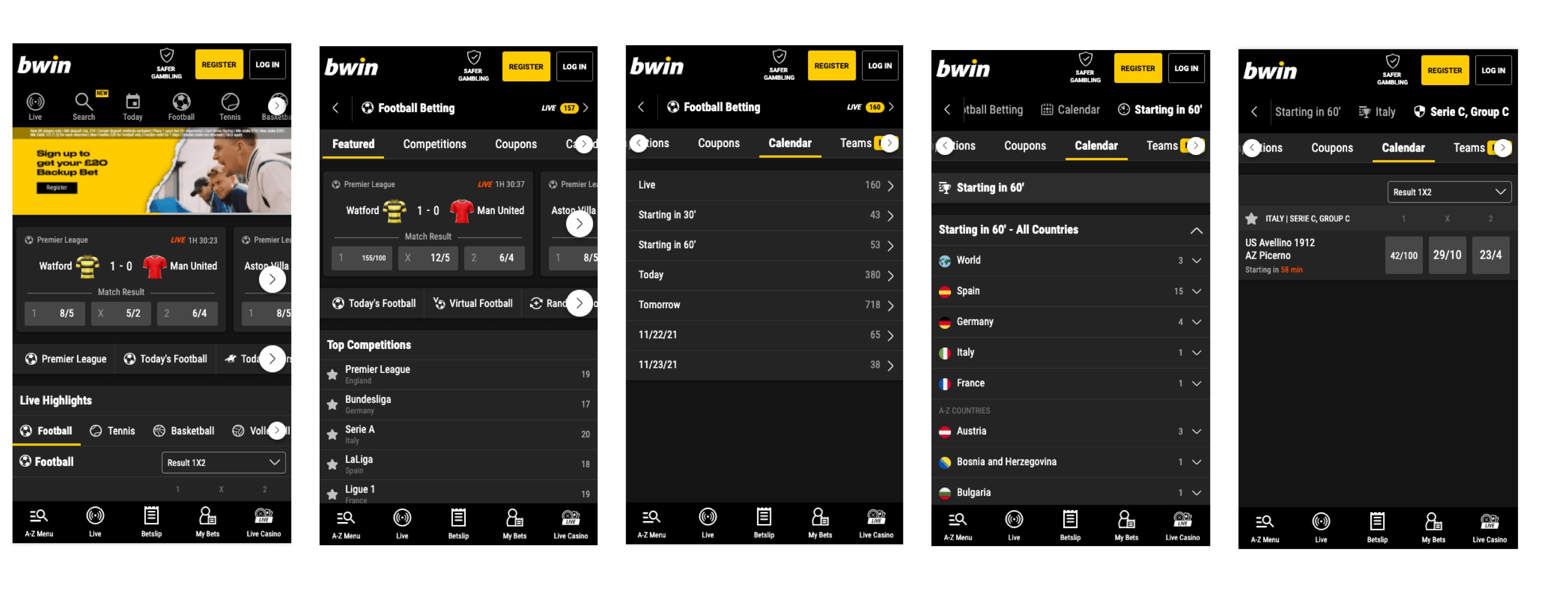
The current calendar journey takes too much time, it is hard to switch between competitions and sports.
Main design challenges
Ensure that users are able to switch between different sports and competitions without friction.
Improve the calendar entry points
Create a layout where users can see event times right away and all available markets.
Not interested in my design process? No worries at all.
Process

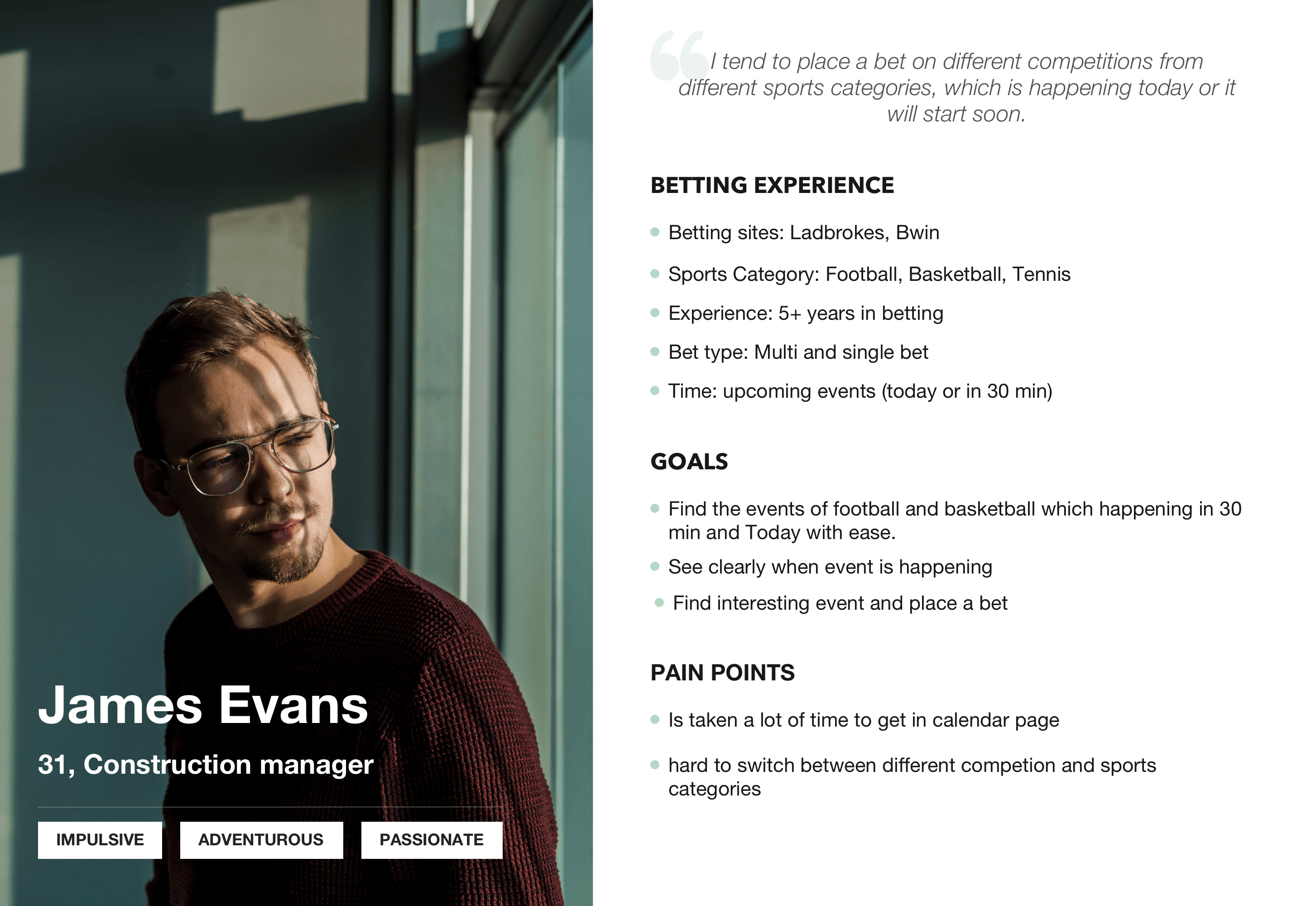
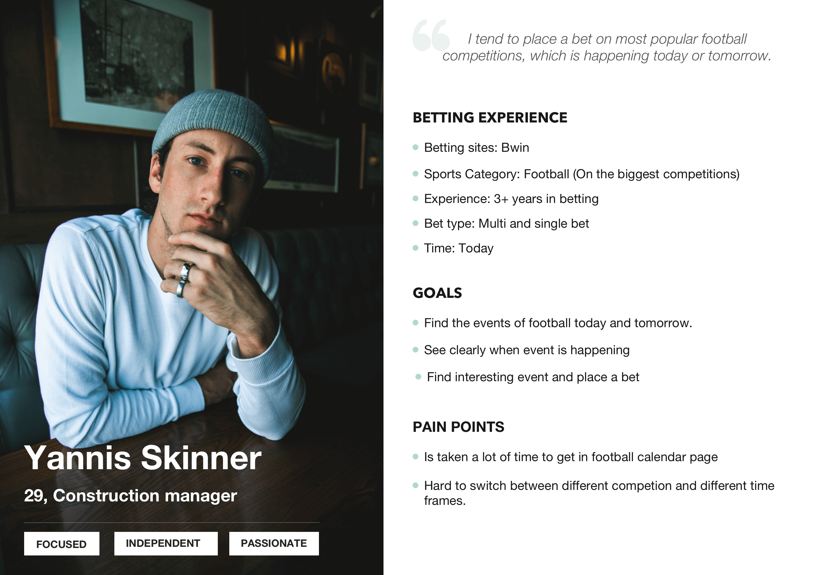
UNDERSTAND USERS
User personas helped indentify two types of users
CURRENT JOURNEY
Current user journey helped identify main pain points and opportunities

Exploring competitors' calendar pages
Analysed competitors to figure out how other companies display time sensitive content, and how the industry shows content where users can filter by time.
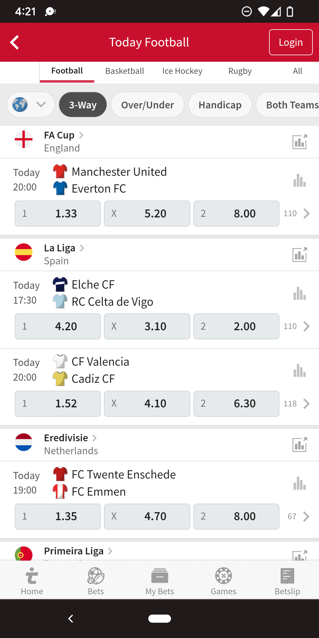
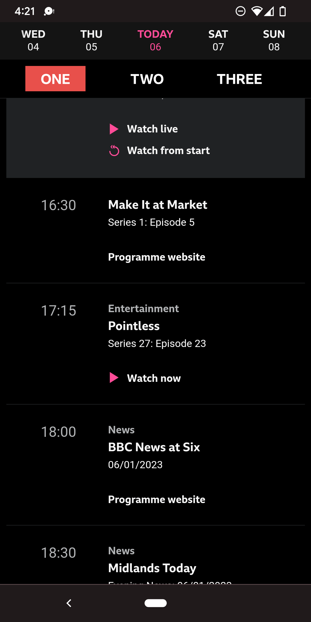
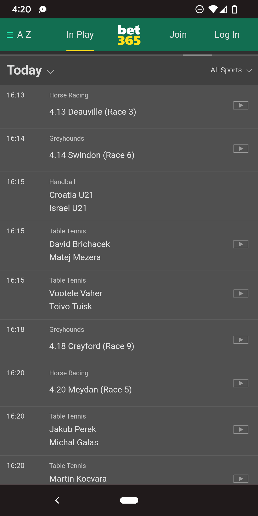
Key findings
Emphasis on time
Date and times should be prominent and highlighted.
Ability to switch dates and sports easily
Display all sports categories on one page and allow users to easily switch between them. All time frames are displayed on one page into tabs, allowing users to switch easily.
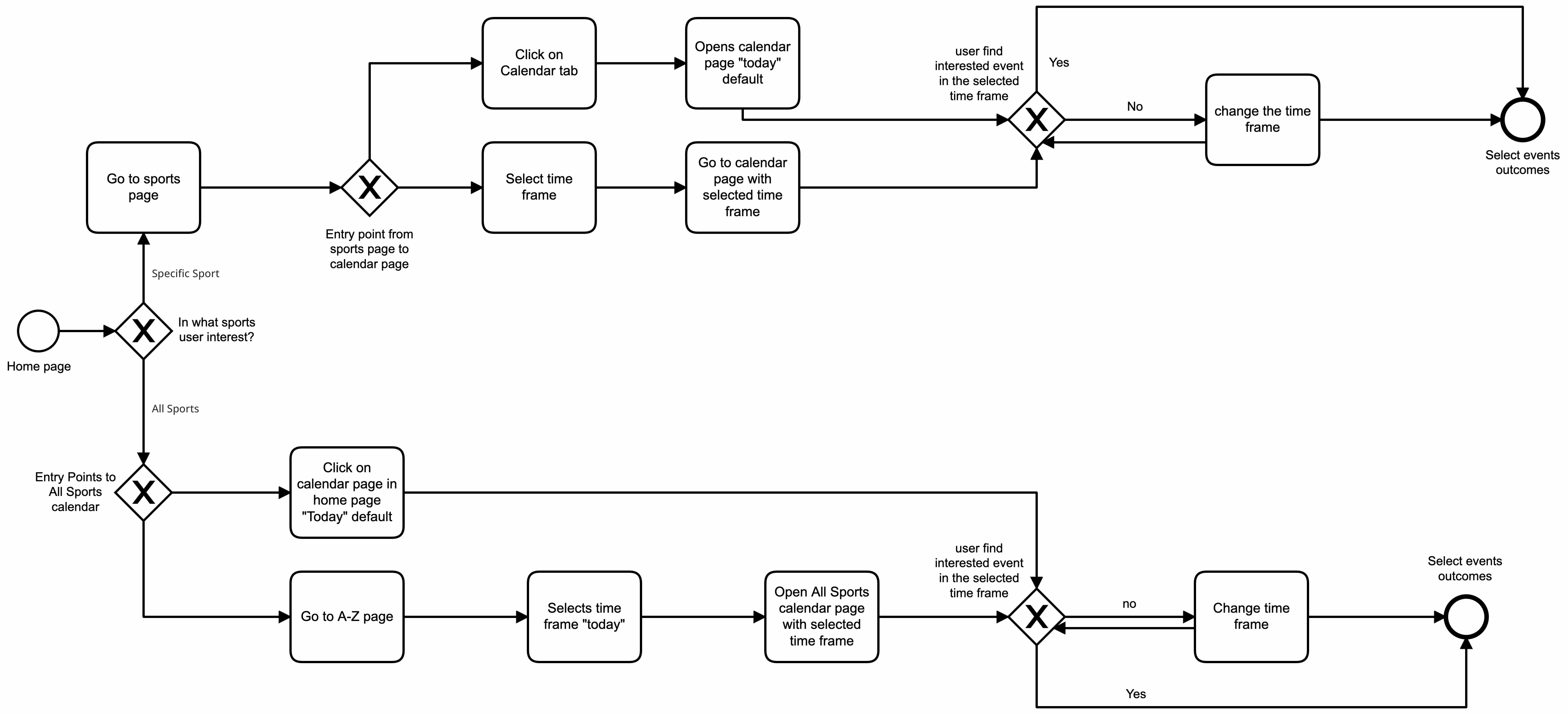
Creating user flow
Mapping the user flow allowed us to identify the optimal journey
DESIGN EXPLORATION
Design concept
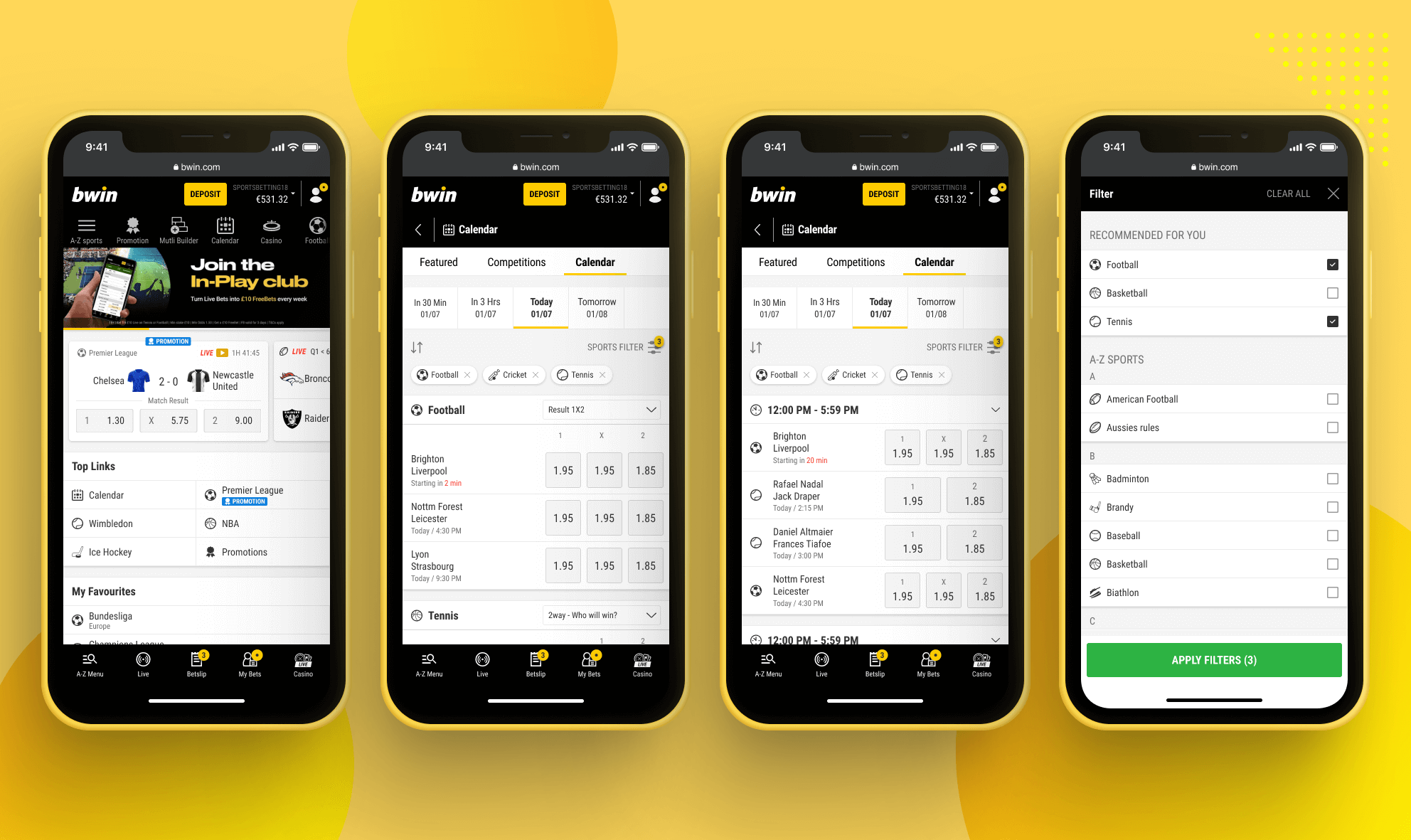
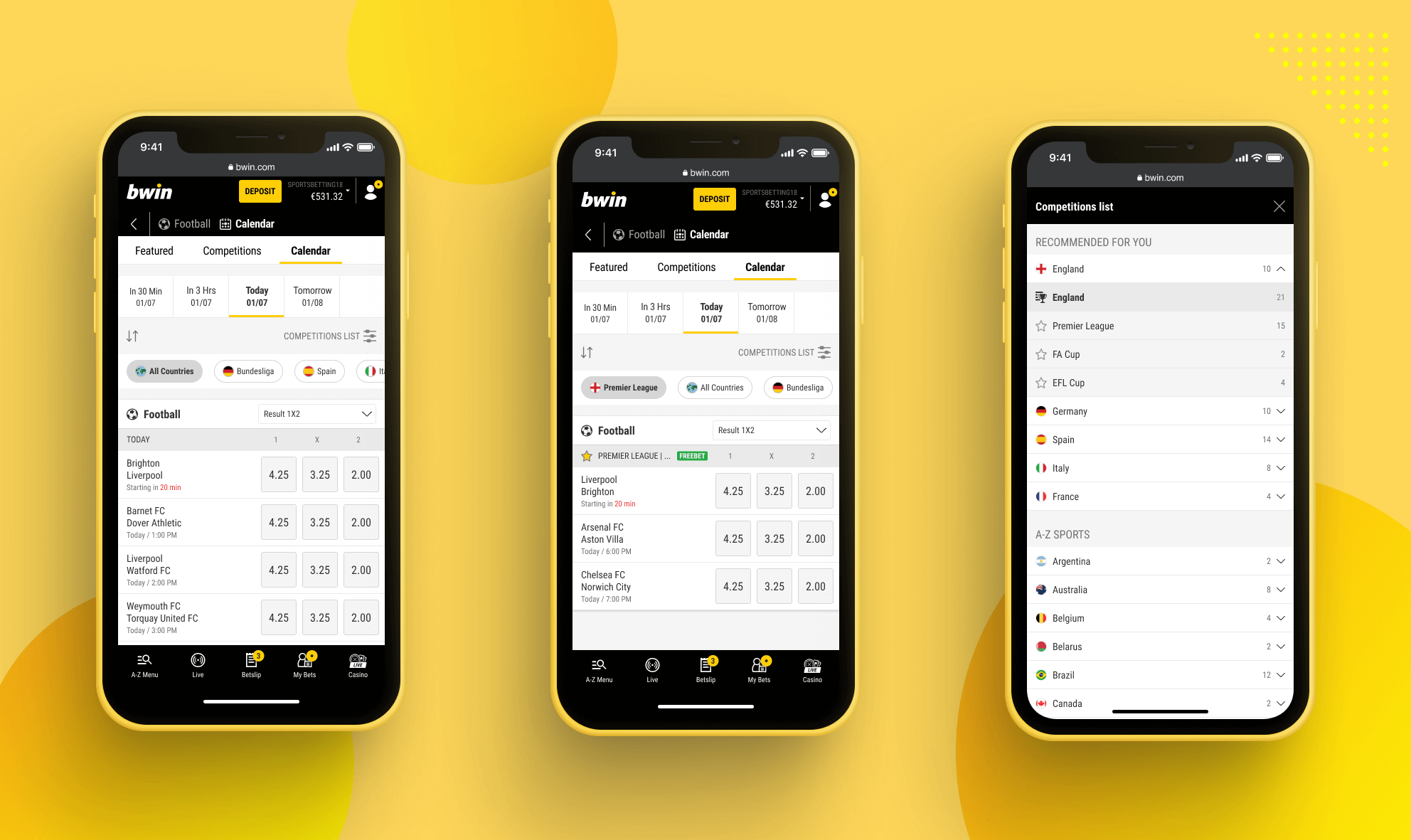
After combining research and brainstorming sessions with the team and PM about the feature, it was decided that the Calendar page should include the following parts:

USABILITY TEST
Usability test helped evaluate the new journey and design concept
Ran unmoderated usability tests with 5 users to see how people navigate to all sports calendar page and specific sports' calendar pages in specific timeframes, how people find events happening at a specific time, and how they use the filter and delete options.
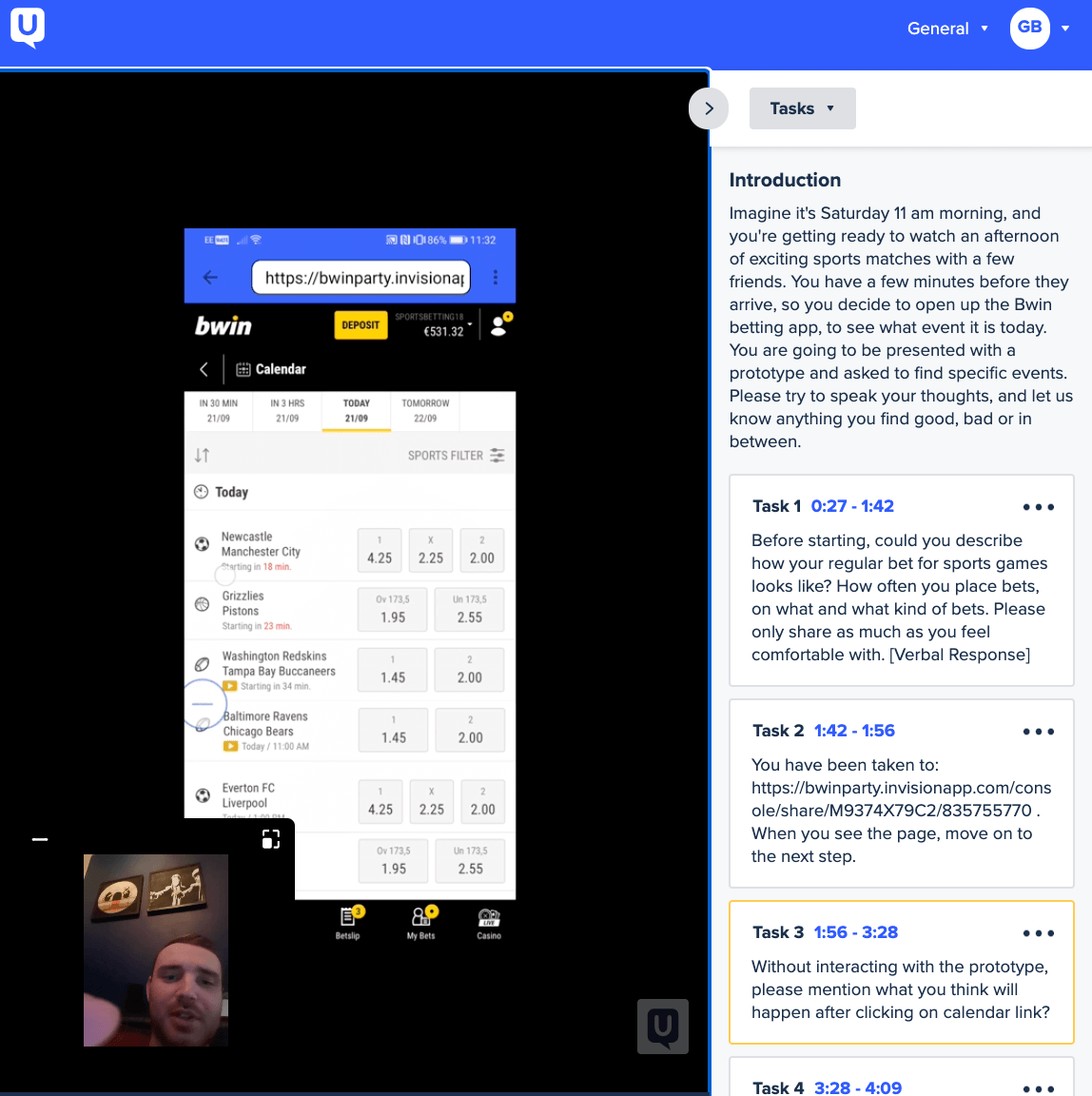
Key findings
Mobile: Hard to see how many filter selections users added
Desktop: users tend to delete by clicking the delete button on pills, which guided us to include remove all CTA button next to the pills instead of having in the filter level. Users needed additional information about match market.
FINALISED DESIGN CONCEPT
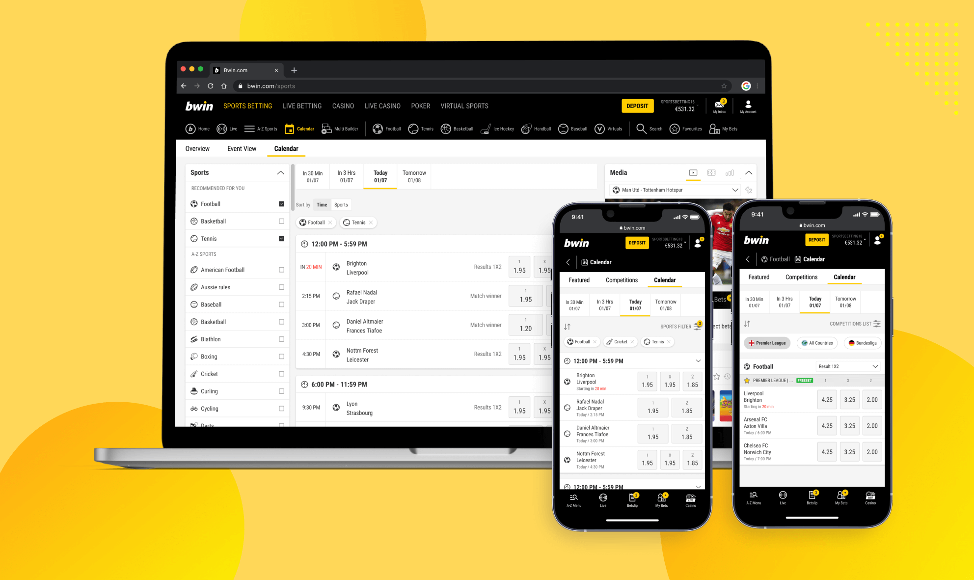
Final design concepts
We changed our design based on the usability test findings: the mobile version allowed to see markets, events entry point from calendar page.
Desktop: having in mind that majority of our users tend to use the delete option by clicking on the pills close button, we included an option "clear all" next to the pills.
Future Considerations
Challenging the core assumptions made in the early stages of the project allowed us to realize that optimizing the whole journey would have a large business impact given the demand for time based betting.
Involving developers earlier in the project would have been beneficial to validate the timeline and technical feasibility.
Research wise, gathering usage metrics on the two flavours of the flow would allow us to cater the experience to the user's habits
It would also be beneficial to understand whether confusion arises from having two calendar types, the sport specific and the "all sports" one. We could then look for ways to better distinguish those two pages at a glance.
