Calendar with Voice assistant
Responsibilities
Project outcome
About the project
The course of HCI focused on different design and research techniques to create effective, user-friendly and innovative technical solutions. My classmate and I implemented a user-centred design model (establishing requirements, designing alternatives, prototyping, evaluating) to create a prototype solution related to time management given its influence on students, and the impact of good time management on stress and grades.
Problem Identification
Through research, we discovered that students have problems with prioritising their tasks and completing all of their tasks in time. Moreover, most of the current time management applications required a lot of effort and time to use properly. To solve this, we conducted the research and provided a prototype solution on how a virtual personal assistant can help students spend less time doing time management tasks and how a calendar can encourage students do better time management.
Main design challenges
How can we help students plan their time with ease and help them complete all of their tasks in time?
Not interested in my design process? No worries at all.
Project process

EMPATHISE WITH THE USERS
1. Academic research and competitor analysis helped understand effective time management techniques
I started by looking at the literature for different time management techniques and their most common failure modes. I looked at VPA, human-VPA interactions, and the main current challenges. Furthermore, I discovered similar products to research their functionalities, visual concept, and how virtual personal assistant can help us plan our day.
2. Semi-structured interviews helped us understand user needs and problems
To have a better understanding of current student time management related problems, their daily habits and planning, we conducted semi-structured interviews with 12 people. I was responsible for writing questions, and facilitating. Given our second focus of the use of Virtual Personal Assistant in a time management app, we aimed the later half of the interview towards their current use of a VPA, as well as their gripes with them.
3. Contextual inquiries helped us understand how people currently manage their time
Having in mind that most people are using a calendar app to plan their day, we conducted contextual inquiries, where I took part in facilitating and planning the research. I asked them to show how they use their current calendar and their issues with them.
4. Surveys helped us understand people's attitude towards the virtual personal assistant and which functions are relevant for them
We conducted a short survey with 30 students who currently use VPA. Our primary goal was to understand what type of events they are willing to create using a VPA and what information they want to review.
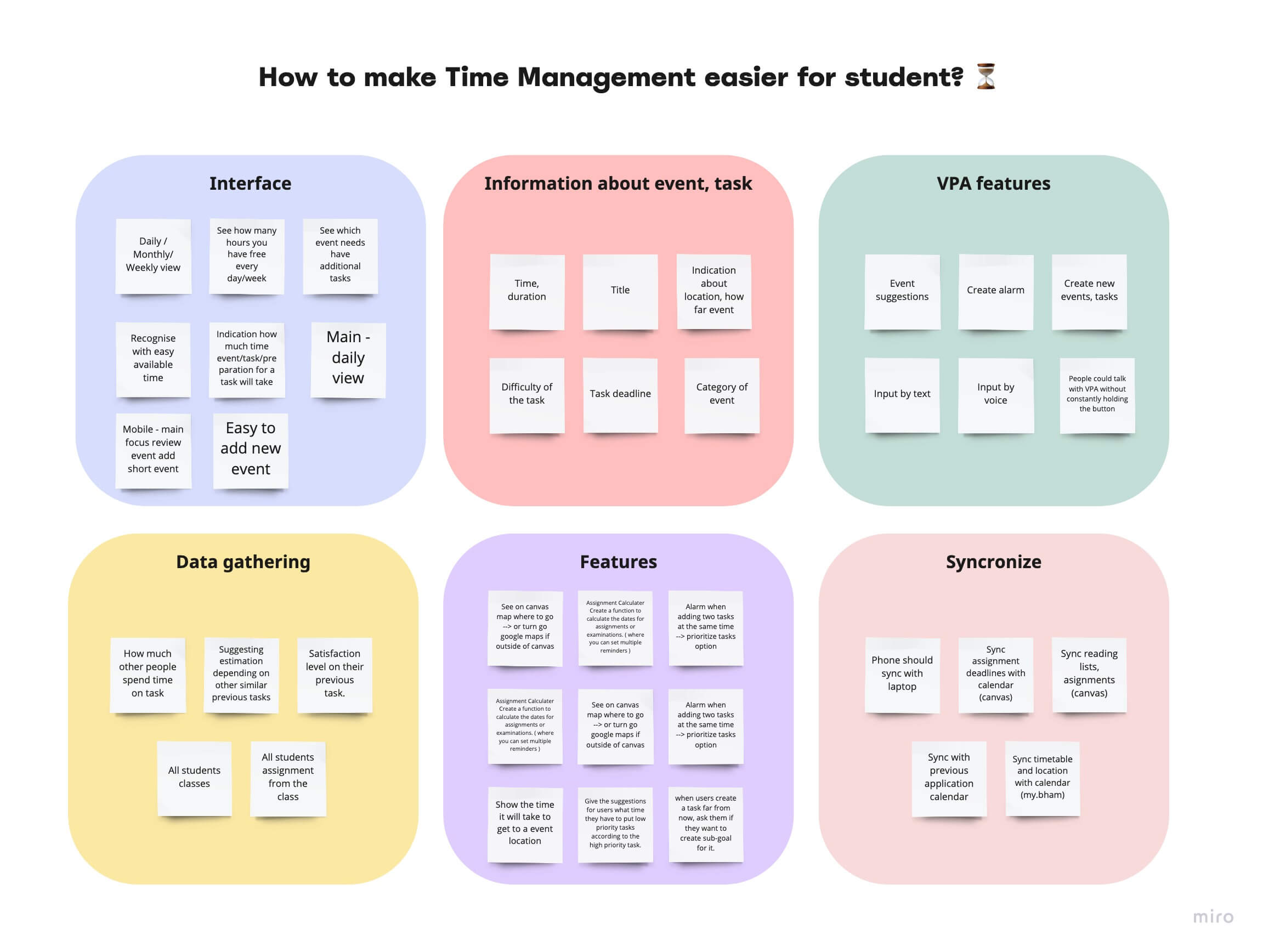
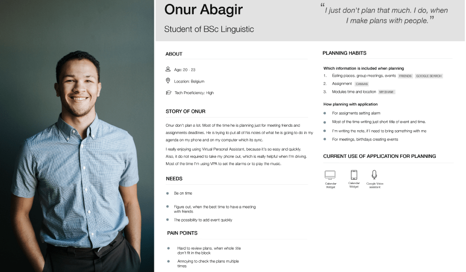
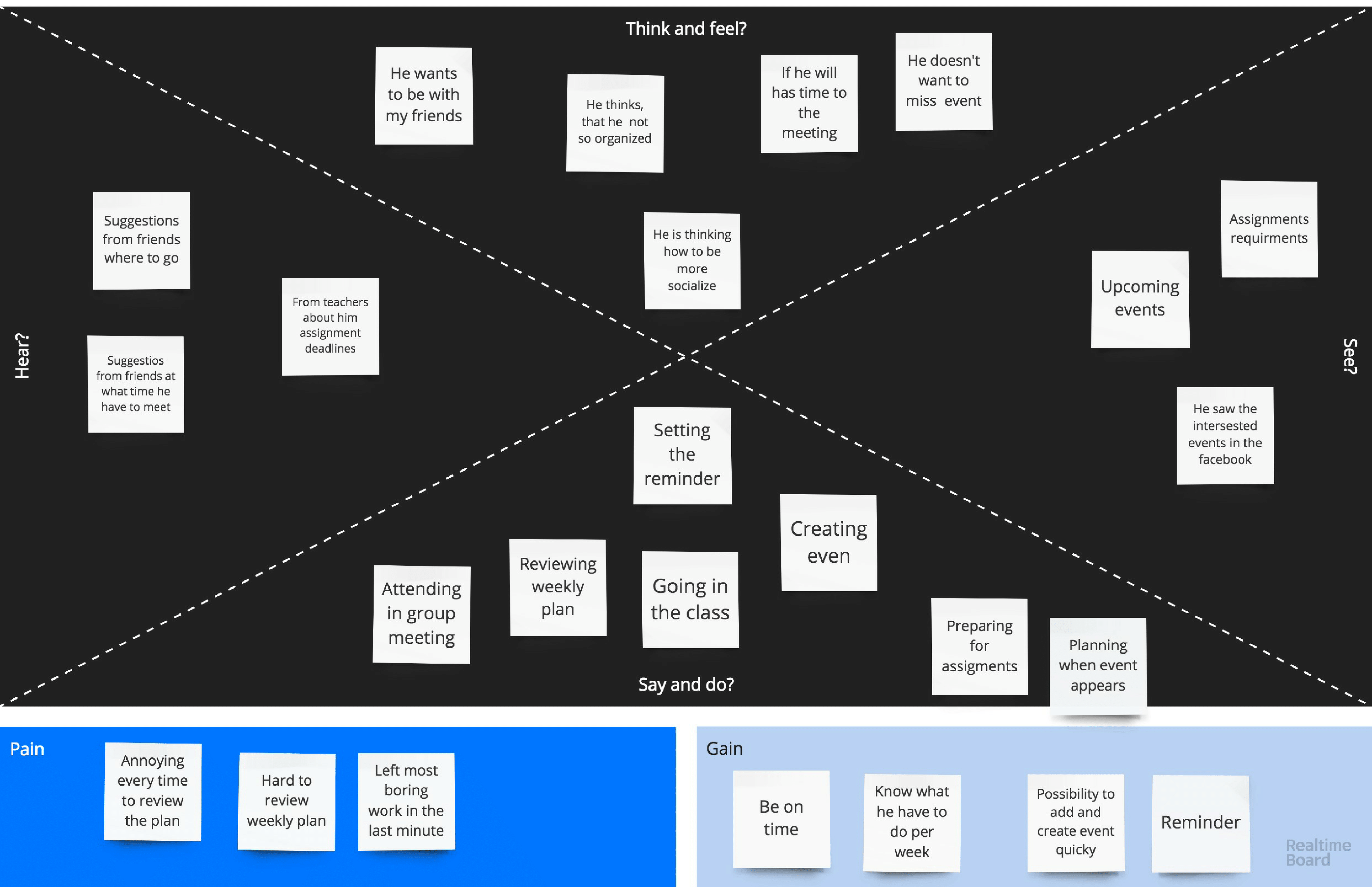
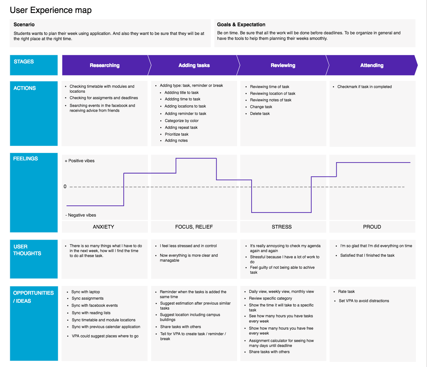
The Persona, Empathy map, and UX map let us better empathise with the target audience and see the product potential.
I created 3 different personas based on the findings from the user analysis, which guided our design decisions based on our target audience's needs.
The empathy map gave us a deeper understanding and insights into the users' feelings, difficulties and needs. I summarized all our target users behaviour and steps that users are taking to plan their days.
DESIGN ALTERNATIVES
Sketches and storyboards led us to discover different ideas
Storyboards and sketches allowed us to work through the app logic of how our content should flow and how information architecture should look. This helped to lay the groundwork for the overall experience.
PROTOTYPE AND EVALUATE
Early testing using paper prototypes helped us gather quick feedback about app
I created low-fi prototypes based on our research and sketches. They helped us iterate quickly and get early feedback on the flaws of our design. After evaluation, we had a clear vision of what the users were missing and what they wanted.
Key findings
Users didn't know what to expect from the "More" button in the create event page.
Some users tend to create events without including a date.
VPA button is unclear. Users didn't find it straight away.
Actions
Redesign the create event page by showing all edit options without clicking the "More" button.
Create a more informative VPA button.
Change the date and time selection screen to fit on one screen.
Virtual personal assistant: persona, dialogue flows, wizard of Oz
We started to create a VPA by giving personality because people can more easily relate to our application and experience when they are able to connect with it at a personal level, which gives them a better emotional experience. Our VPA persona is based on our application values and the qualities we wanted the user to perceive when they are talking with our VPA.
After creating a persona for our VPA, I started to create a diagram of conversation flow, which listed all the different ways people achieve a given task (create a reminder, create an event, review upcoming event). When I had a clear idea of the possible scenarios on how the user could interact with the VPA, I wrote a dialogue sample for each task.
During Wizard of Oz testing, users thought they were interacting with a real voice assistant, where it was in reality controlled by us. This method helped us identify how people use and react to the system, and whether the VPA has appropriate responses.
Hi-fi prototype helped us visualize the solution in a more detailed way
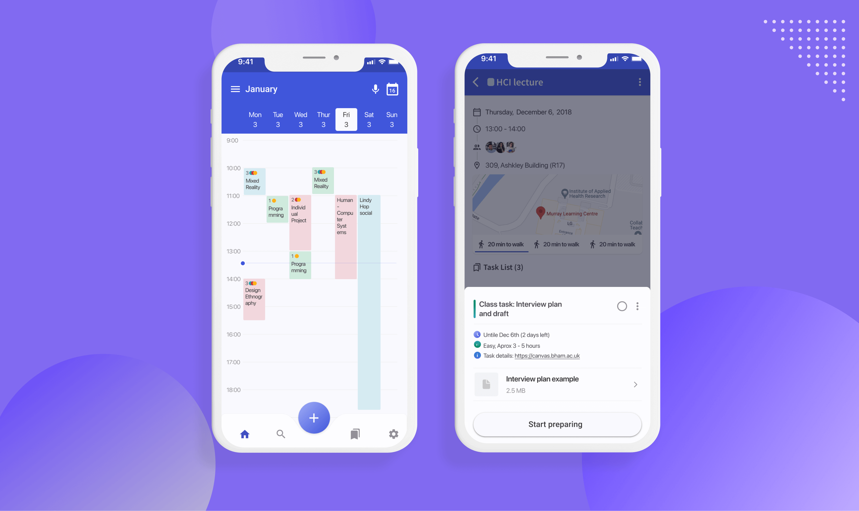
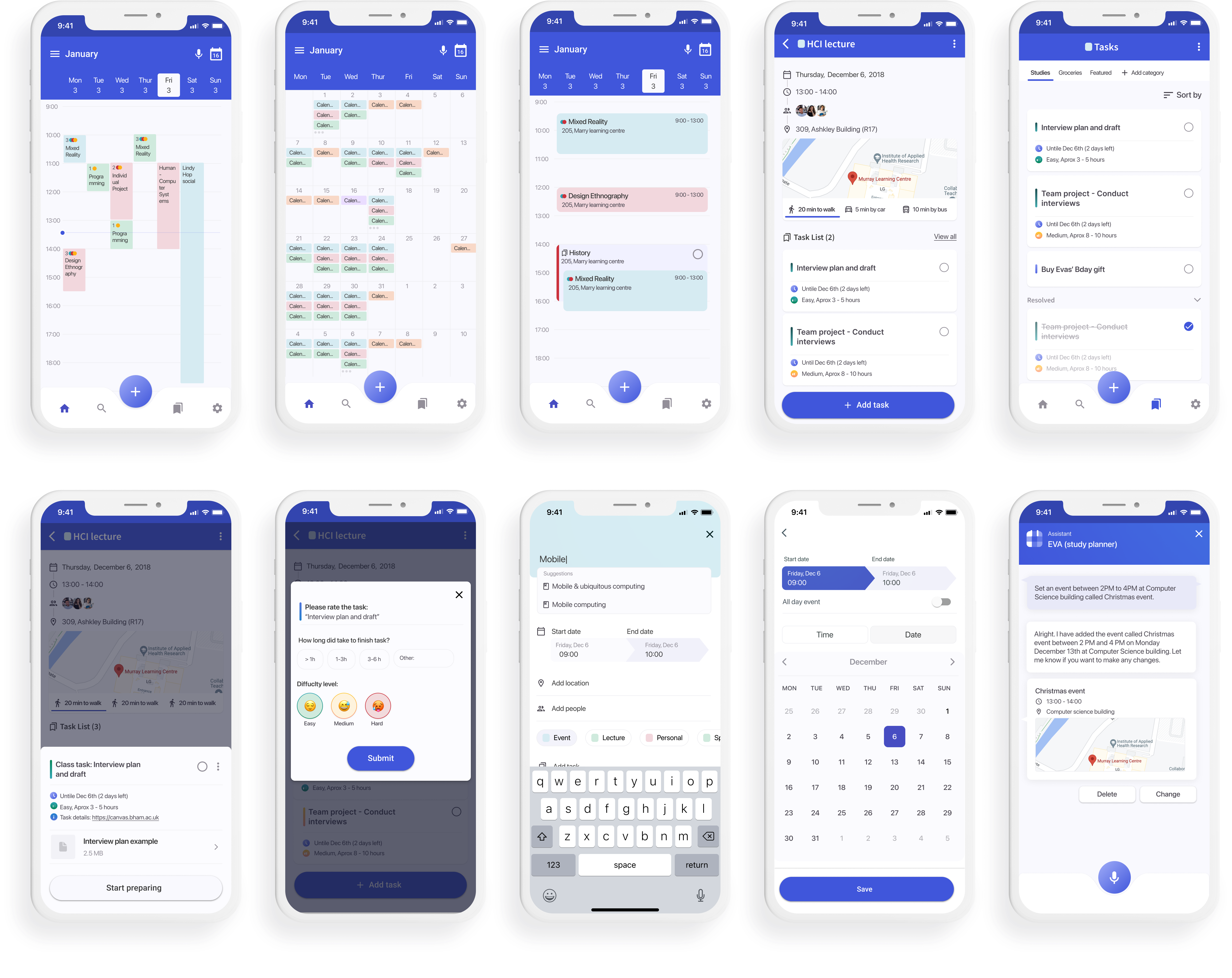
The final stage of our project was to create a hi-fi prototype of the application according to problems we identified during the previous evaluations. When we created hi-fi we tried to focus on a design principle, usability aspects, which would help us to create a user-friendly prototype.
Prepare function
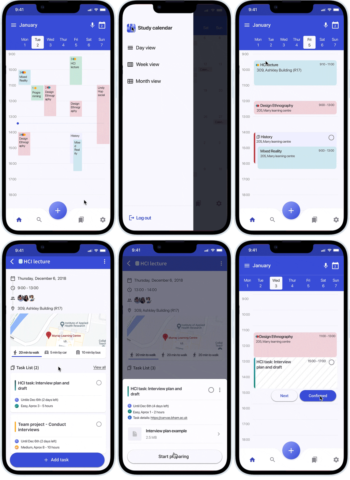
According to our research, most of the students do not know at what time they should do a particular task (assignment, test, exams), because they don't know exactly how much time they will spend on it. We created a prepare function, which suggests the best time slots to work on the task, according to how much time other student spend on it.
VPA visualization
VPA visual conversation consists of spoken prompts, Display prompt, Chips, Visual prompt. These visual elements help to engage with VPA more efficient, prevent users from the errors and ensure Visibility of system status.
Readability, usability, consistency of the context
To ensure readable content, we created bigger blocks, where all the essential information could be placed. To ensure that student are on time, we visualised how much time it takes them to travel to a specific event (by foot, by car, by public transport). The application provides a minimalistic design and consistency between the pages. Navigation was therefore made easier for students.
Conclusion
Developed a Hi-fi prototype, targeted at helping people manage their time better by providing a "prepare" feature and incorporating a Voice assistant which helps plan their day with ease.
Future consideration
It would be beneficial to test the final design concept with users, to understand how do they use prepare functionality and VPA.
Also, it will be valuable to do more research for the VPA, especially regarding how students can be motivated to do a specific task, or to help create the event in the most convenient time slot.


