Super Insurance feature for betting app
Responsibilities
Outcomes
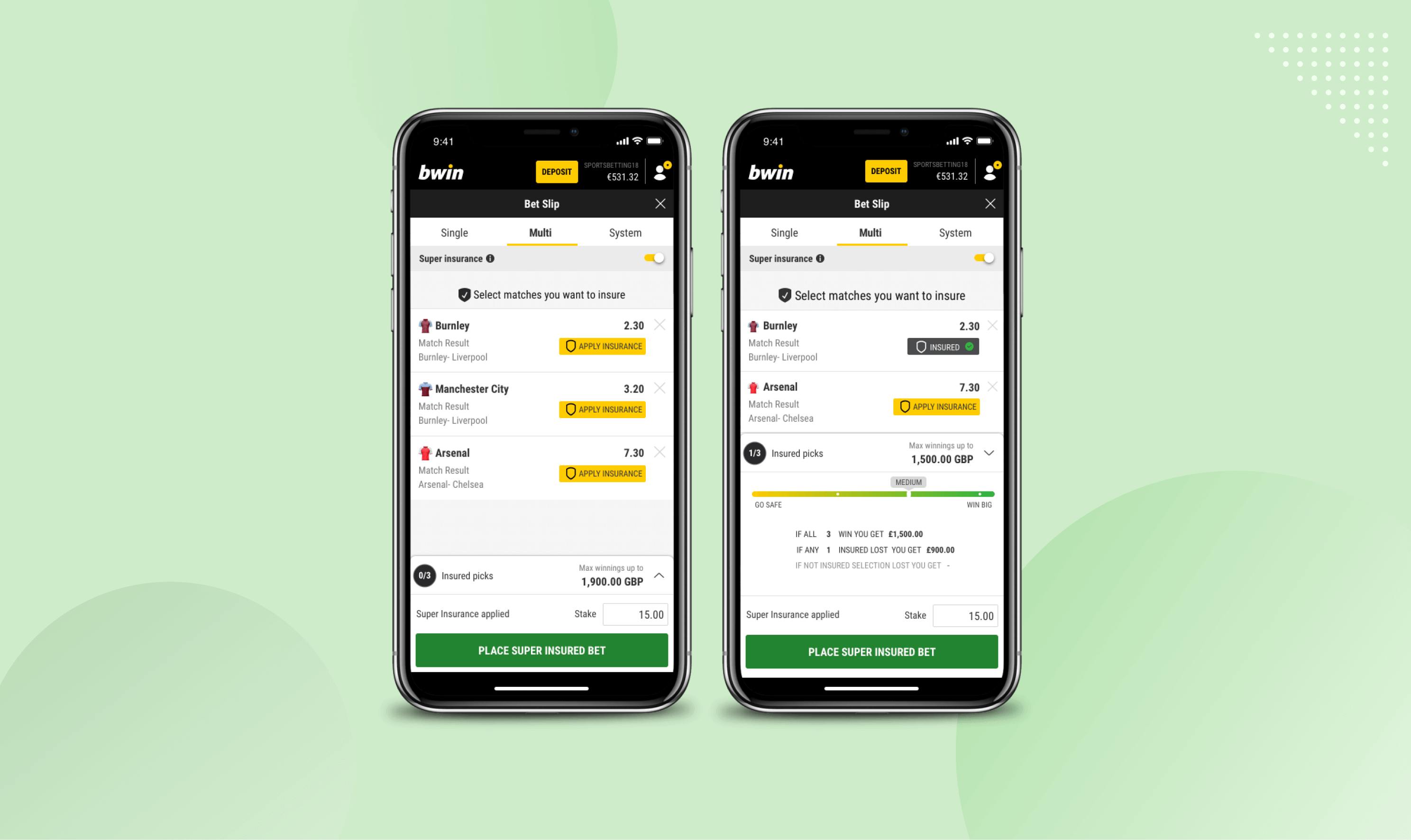
Provide users full control over their multi bets by offering them a chance to guarantee a placed bets returns, even if some selections lose, by developing Super Insurance design concept. This feature should increase the average number of sub-bets that comprise a multi bet.
About the project
Multi bets are a way for users to bundle bets together to increase returns. During my work in the Entain group, I had to create a design concept of Super Insurance feature for the Bwin app. The Super Insurance's main goal is to allow users to win the multi bet, even though some bets lost.
Problem Identification
Multi bets with high numbers of sub-bets have a higher risk of losing, but allow users to get bigger returns compared to other types of bets. A lot of people don't feel confident placing a multi bet with a high amount of the sub-bets given their low winning probability.
Main design challenges
Create a smooth transition from multi-bet to super insurance.
Ensure that the user feels more confident placing a multi bet with a high amount of sub-bets
Present the winnings breakdown clearly, so users can understand how insuring sub-bets will affect their original odds.
Not interested in my design process? No worries at all.
Process

UNDERSTAND USERS
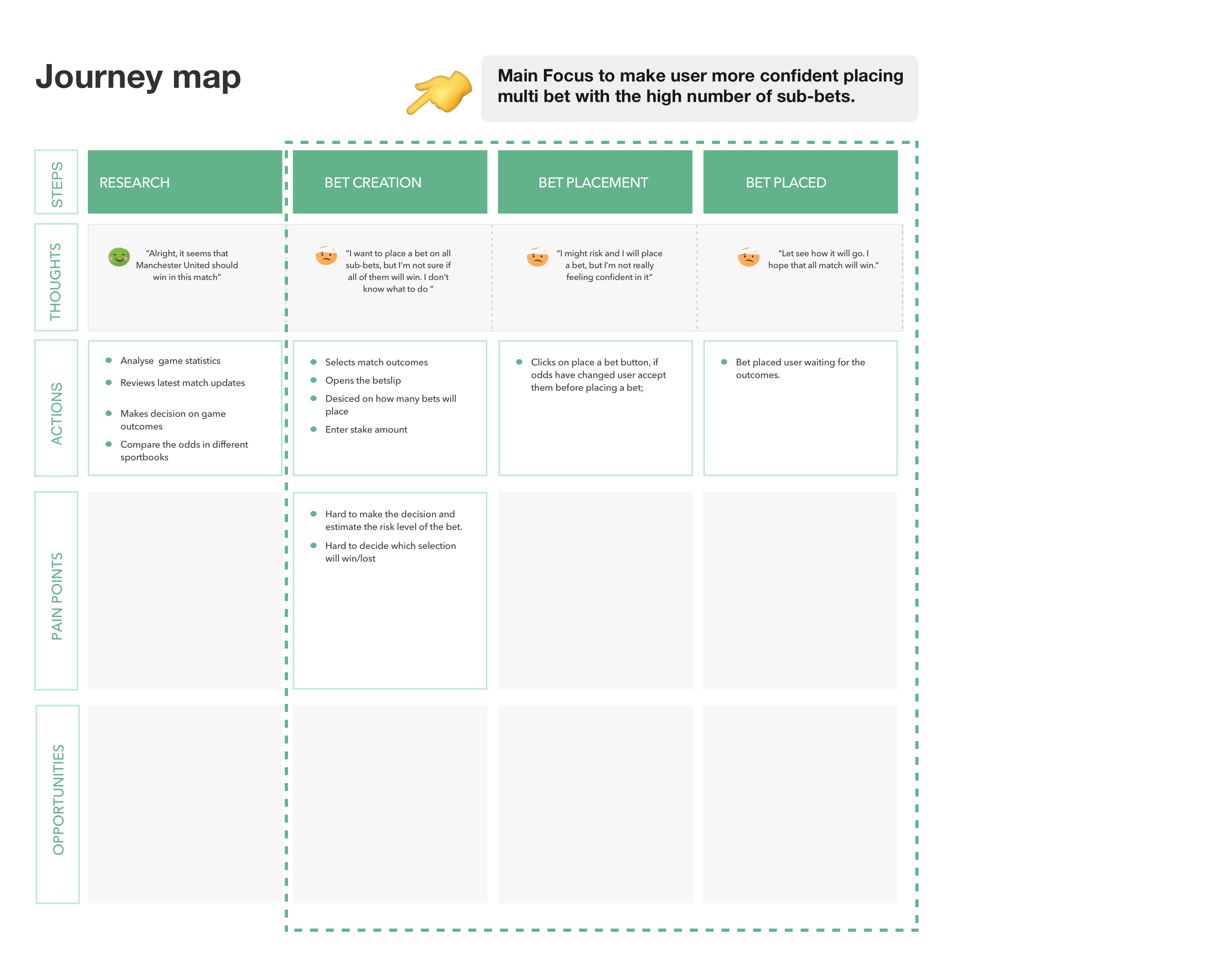
User persona helped empathise with the target user group
Our most common type of user tends to place multi bets with a high number of sub-bets, but doesn't feel confident about the outcome


DESIGN EXPLORATION
Design concept
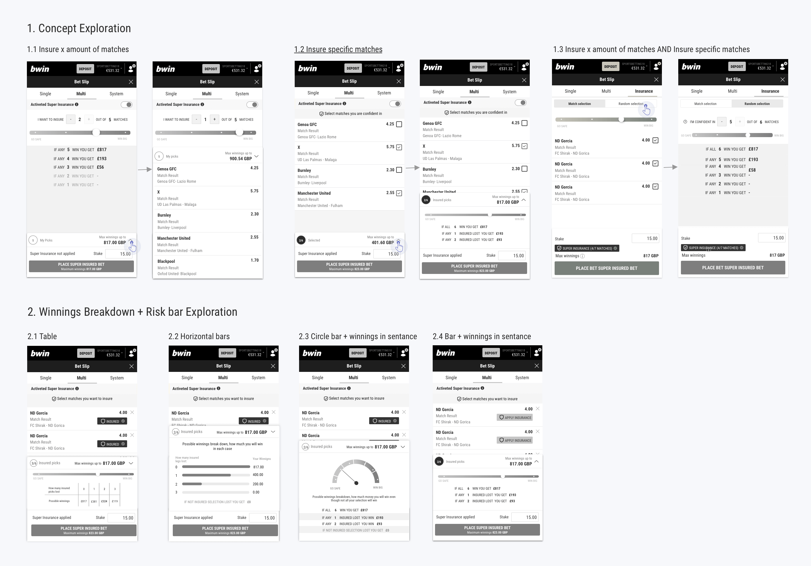
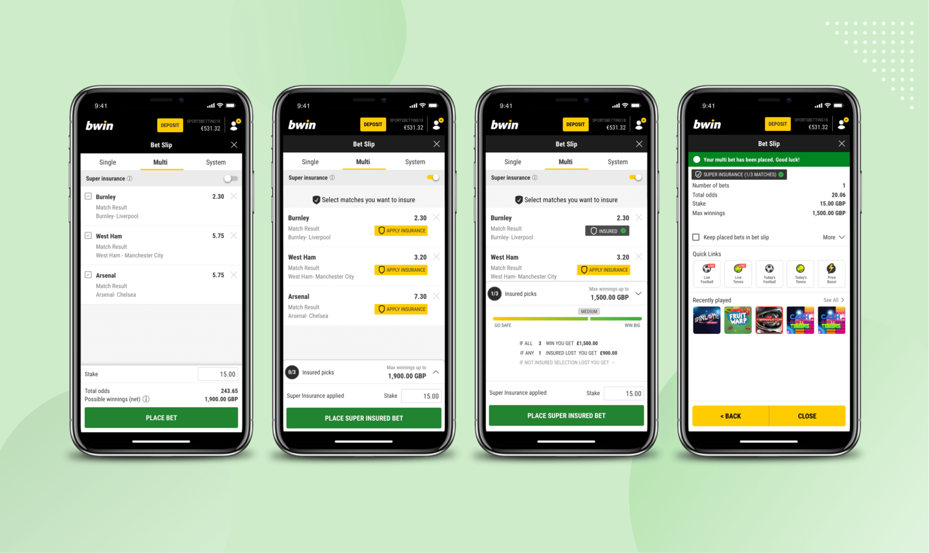
After brainstorming with the team and PM about the feature, we decided that the Super Insurance design should include the following parts:
During the design exploration phase, I designed different concepts: Insure a specific match, insure any x matches, or provide both options. After discovering all edge cases and discussing them with the internal UX team and PM, we decided that it would be best to let the user insure a specific match. This way, the user will be able to get higher winnings while being more in control.
Comparative test to find out which version increases confidence
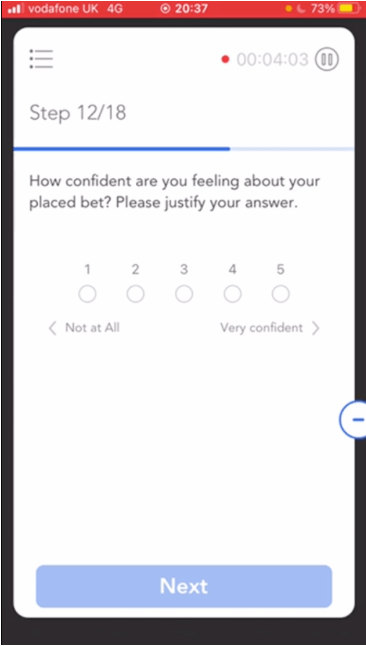
I came up with two different concepts for insuring sub-bets, which might impact how many sub-bets they get insured, and how confident users feel about their bet. I ran a remote unmoderated comparative test between group (group #1: 19 users, group #2: 19 users).
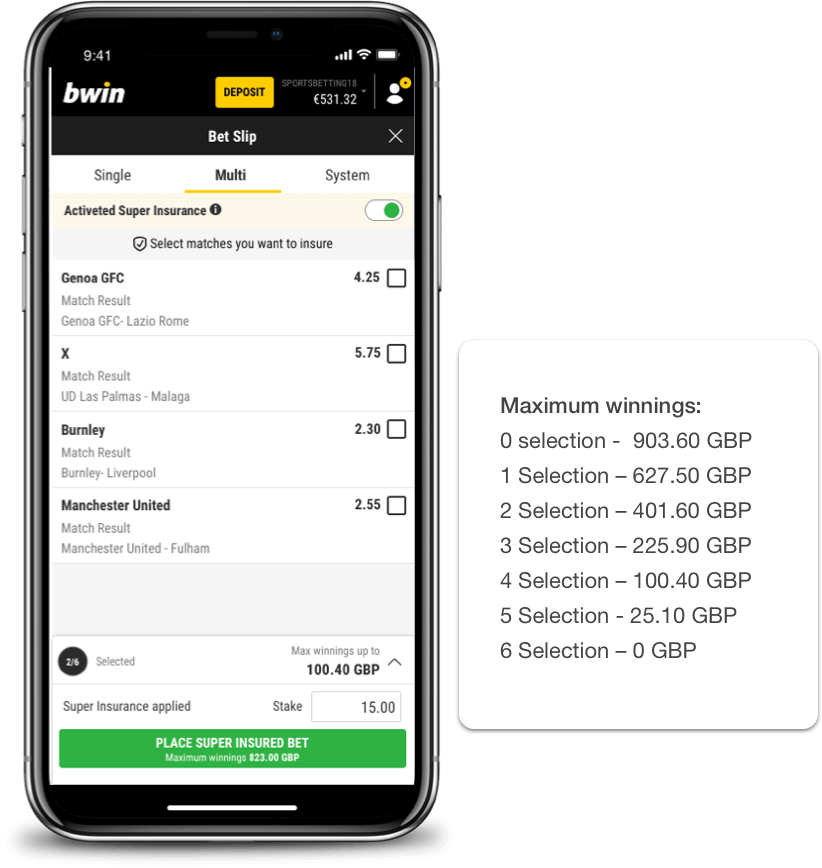
1st version - Users have to select which matches they want to insure. In this case, if the user loses the insured match, they will get some of the winnings. The more insured sub-bets, the lower the possible winnings.
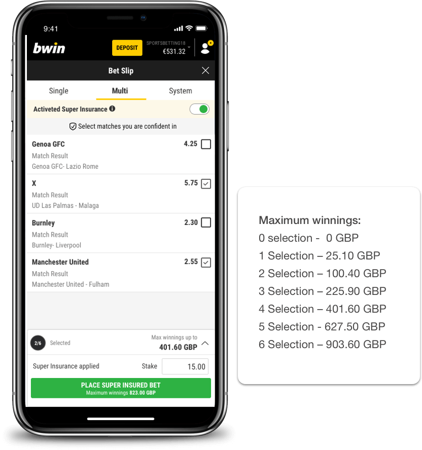
2nd version - Users have to select sub-bets they are confident about, those not selected are insured. If at least one of the selected sub-bet loses, the user doesn't receive any returns.
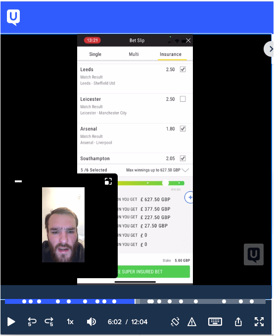
Key findings
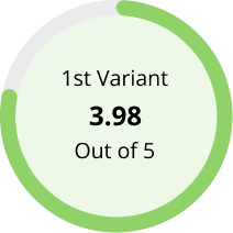
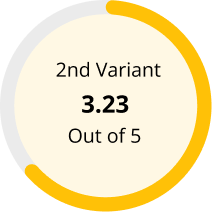
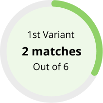
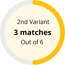
1st group, people insured a lower number of sub-bets and perceived a higher possibility of winning
This made them feel more confident about their bet. Thus, the version where the user has to select sub-bets to insure is the better solution.
Winnings breakdown has to be more prominent
All participants recognised that insuring more sub-bets lowered their possible winnings. However, only 4 out of 38 opened the full possible winnings' breakdown. Thus, the winnings' breakdown should be more prominent or included in the onboarding.
Users need additional information on how the feature works
The majority of users mentioned being unclear on how the super insurance works and how it is affecting their original bet. Thus, an additional onboarding message and explanation should be displayed.
Overall perceived feeling to win
Insured matches
FINAL DESIGN CONCEPT
Usability test to test full super insurance journey
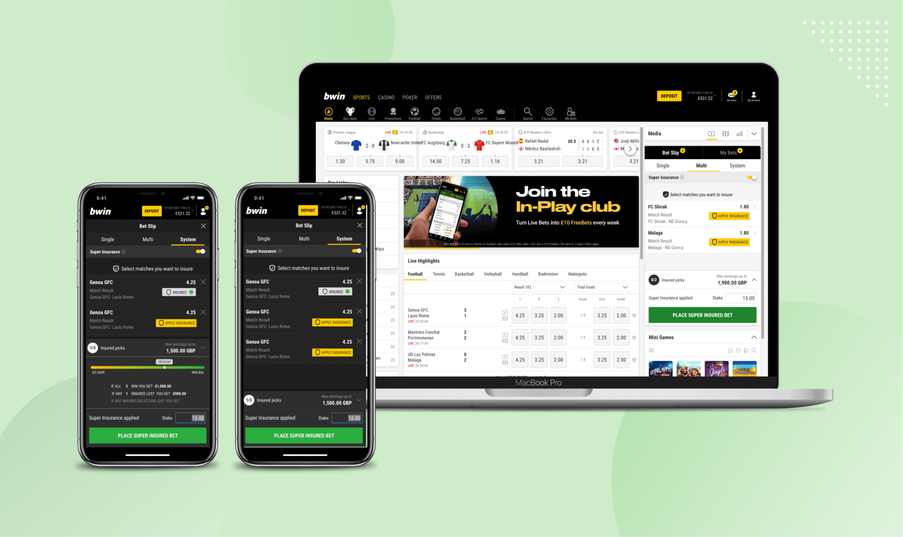
After making changes to the design, based on the feedback from the usability test, I ran another usability test, focusing on the whole super insurance journey. Additionally, and I tried to understand: How do people tend to apply super insurance? How do people interpreted risk and possible winnings breakdown? Is the impact on their original bet clear?
Key findings
Easy to use
Everybody found the design intuitive, how to apply the super insurance was easy to understand. All test participants understood that it would decrease their maximum winnings, but insure their selected sub-bet. However, several users wanted terms and conditions about the feature as they weren't sure how it would affect their original bet.
Amount of minimum winnings should be more prominent
When deciding how many selections to insure, users focused on how much the maximum winnings decreased compared with their original winnings. When users use this feature, they didn't see straight away the minimum winning information. Thus, the amount of the minimum winning should be more prominent (e.g. open by default all the time)
Users understand what returns they will get
Regarding the possible winnings' breakdown, a significant amount of participants understood what amount they would get in each situation (losses/winning). They liked the clarity of the information displayed.
Slider UI
The majority of the users tried to interact with the risk bar because they presumed that it would increase or decrease their odds. Thus, the slider should be updated to either include a swiping functionality or change the UI to make it look less like an interactive element.
Future Considerations
During this project, I understood how people's perception can be influenced by small design decisions, and how this in turn affects their behaviour.
Regarding making people - especially new users - more confident about placing a bet with a larger amount of sub-bets, it would be beneficial to provide additional information about the past performance of the selected team next to the sub-bets.
We also found out that people tried to interact with the risk bar. Thus, it would be beneficial to explore how it could allow users to compare how many selections they have to insure and what returns they will get in each scenario.