Video Streaming app
Responsibilities
Project outcome
About the project
This product is a free video streaming service that consists of 4 major channels (Dave, Drama, Yesterday, W). Within a 6-month period, we defined and documented challenges with the current version of the product and created new designs for TV, Web, and Mobile App.
Problem Identification
Through our research, we discovered that the main reason users leave the service is due to a lack of personalised content and of new content. Another major issue was user retention as well as attracting new users. For our younger audience, our products looked dull and unattractive and therefore needed a more engaging experience. Also, many users visit the website once and never complete the registration flow.
Main design challenges
Improve the product to attract a wider audience, age wise.
Improve content discovery.
Better advertise our product's benefits, and improve the registration process.
Not interested in my design process? No worries at all.
Process

DISCOVERY
Discovery workshop
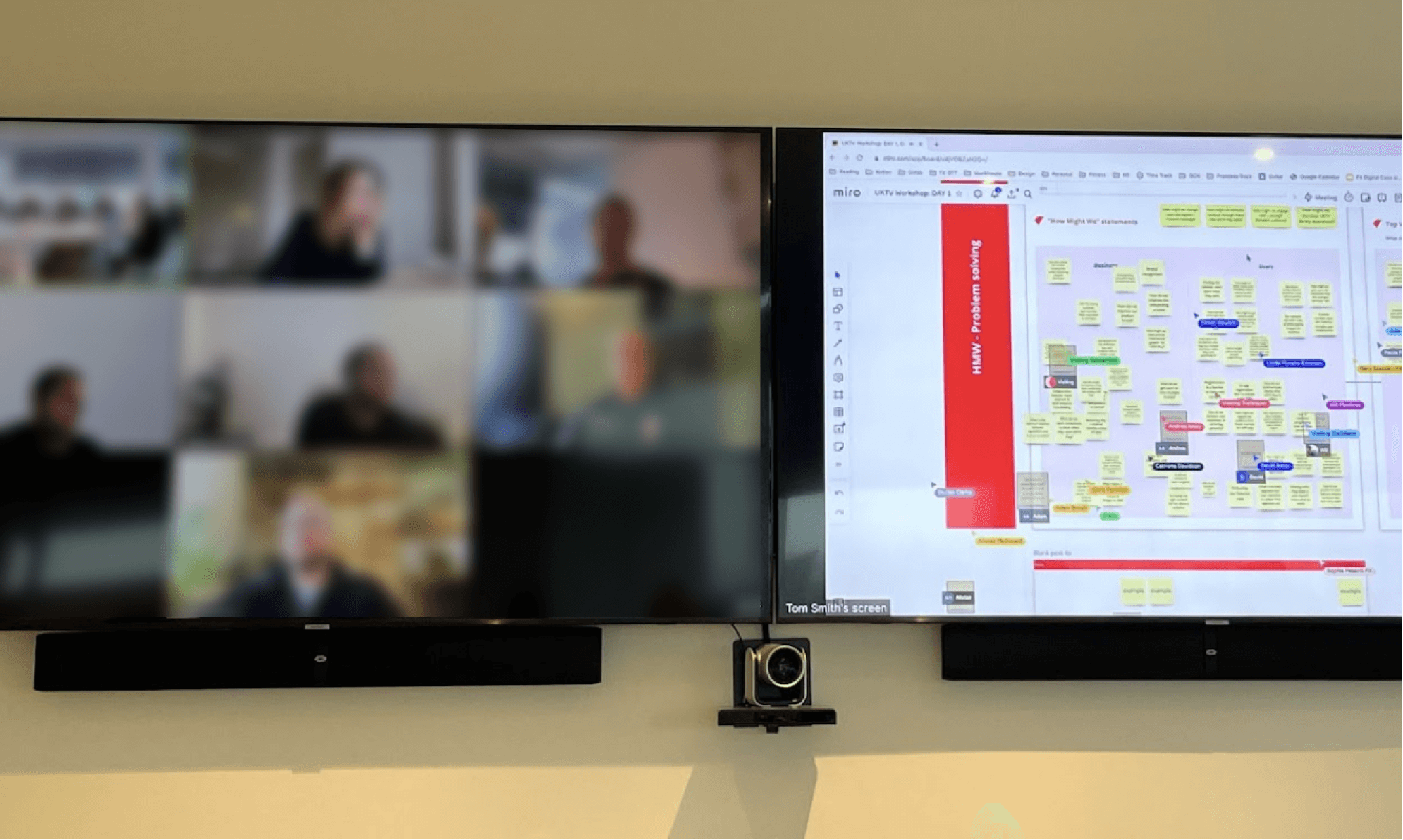
We facilitated a one-day workshop with the client, including product representatives, VOD, digital, marketing, content, insights, advertising, and dev teams.
During this workshop, we looked ahead to the future. We identified current challenges with the product and discussed what an optimistic future would look like over the next 3 years, as well as listing the potential risks.
In the second half of the day, we focused on the content types and future plans, user personas, and the future of the brand. This helped us better understand all project criteria for a successful delivery.
Competitors analysis
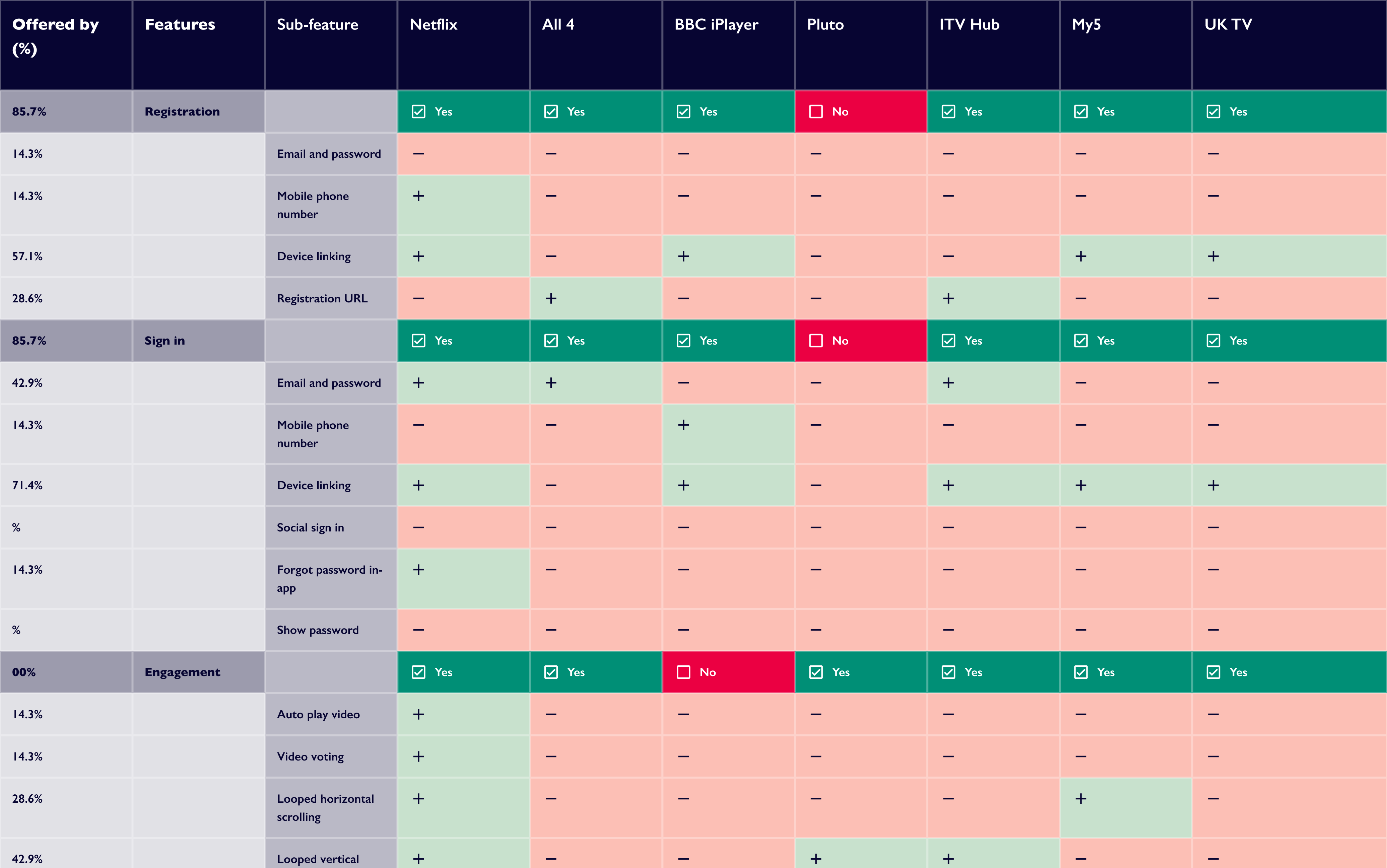
I looked at competitor products and their design of core features to benchmark the client's product and identify areas for improvement.
I primarily focused on CTV and outlined how they implemented in-app registration, log-in, advertisements, video player, live channels, TV guide, content discovery, engagement, and retention. This analysis also addressed other platforms: mobile, and web.
Contextual inquiries and user interviews
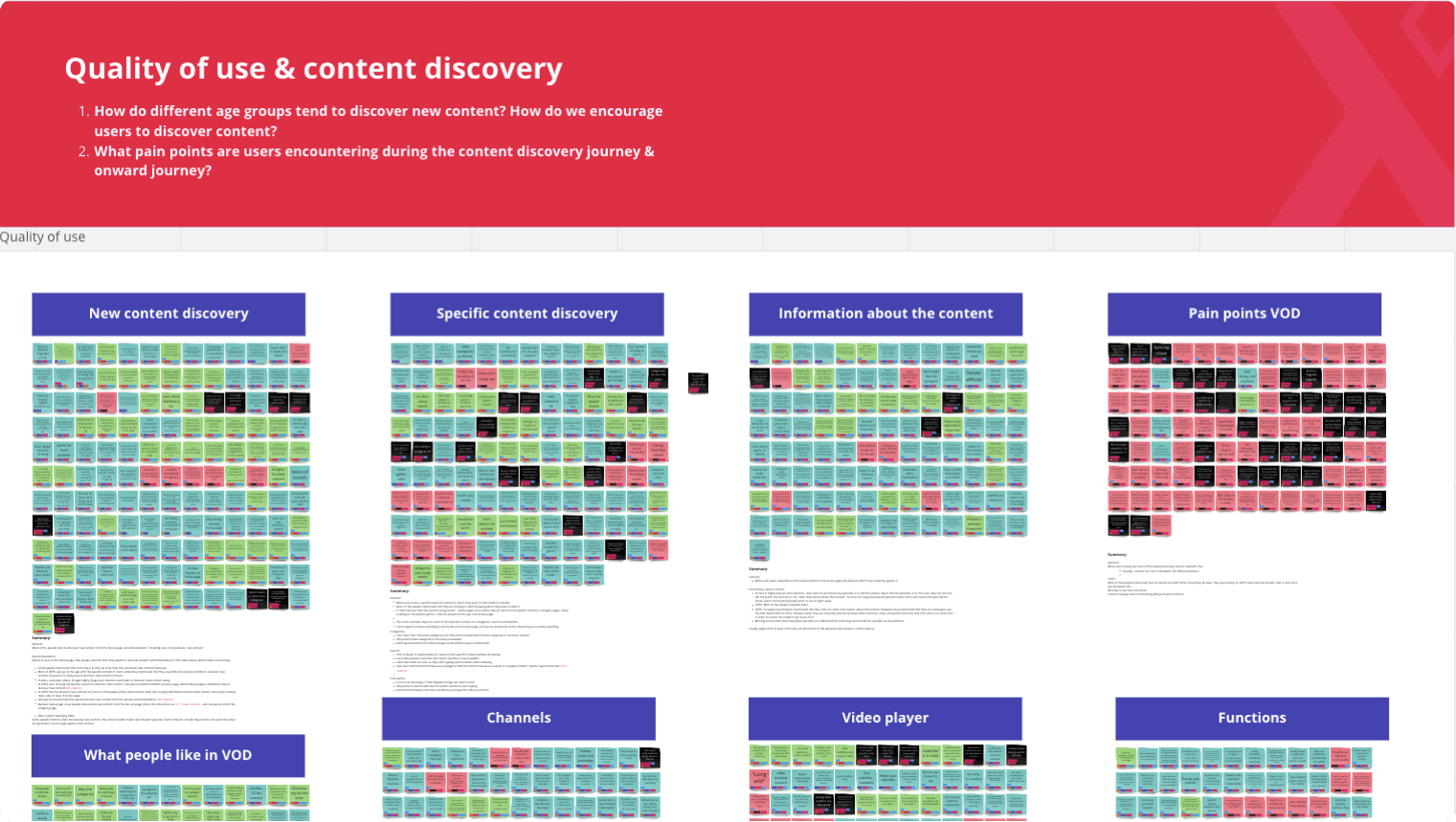
I ran user interviews and observations to understand the major pain points users experience when using the client's product across all platforms (web, mobile, and CTV) and how potential users interact with VOD services.
Main goal: Explore user habits, their ability to discover specific content, and their challenges and needs.
Users: 27 people participated in the study. This included a mix of ages, genders, ethnicities, accessibility needs, and represented various regions across the UK. Interviewed users were also spread across different audience groups (current users, lapsed users - who haven't used the product for more than six months, and potential users - who currently use another VoD service).
Challenge testing for CTV
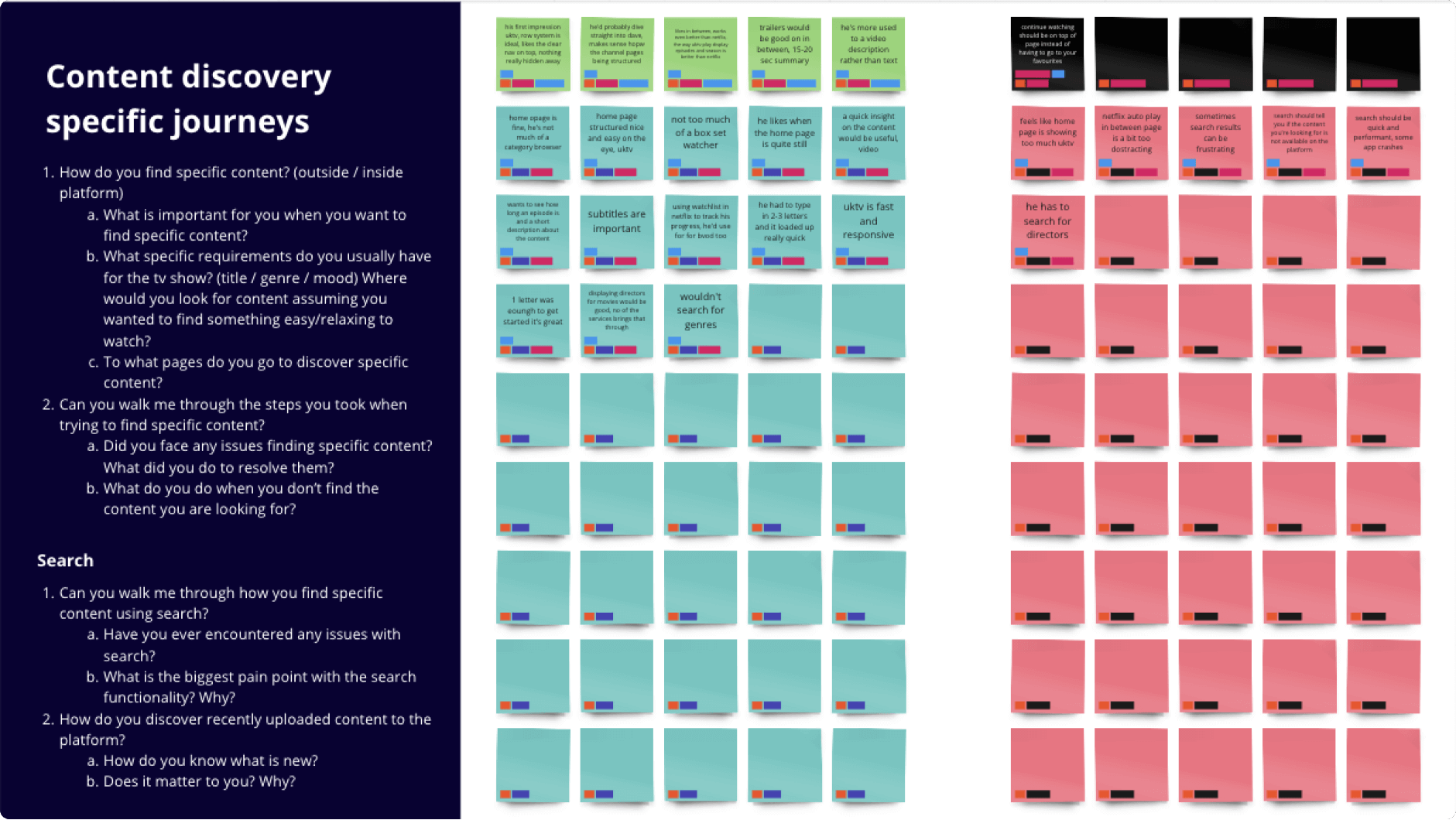
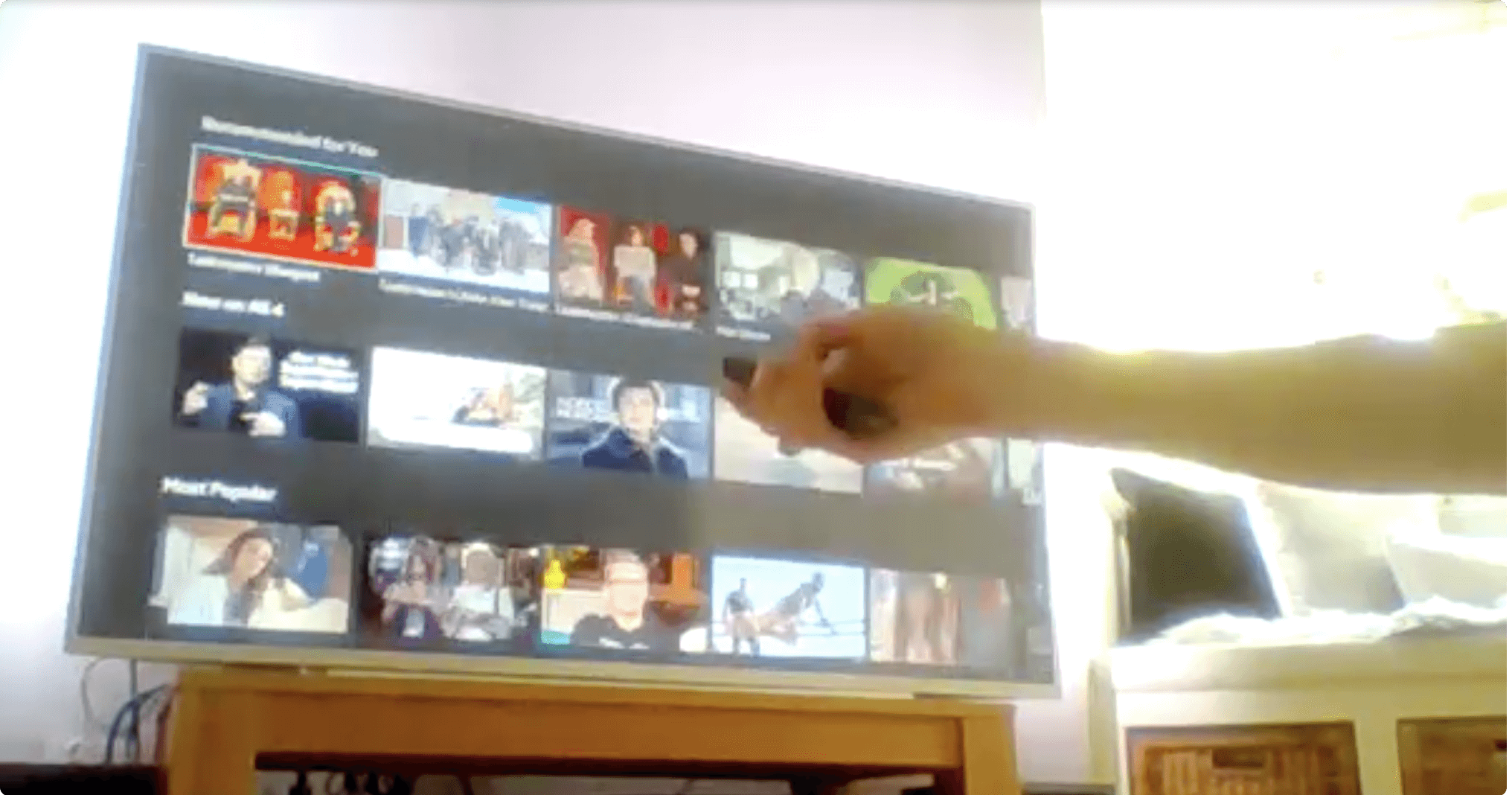
The biggest challenge during the remote user interviews/observation test was to enable users to share their TV screen through a Zoom call. Our solution was to send them clear instructions on how to set up their laptops before the session. We asked them to place the laptop 10-12ft from the TV and to point the screen toward it. While far from an ideal setup, it was good enough to see and understand how people interact with the product, their habits, and their main pain points.
Key findings
Users leave due to a lack of content and a lack of relevant recommendation
The device linking process is confusing. People are unable to finish this process via a secondary device.
Channels is a dividing feature for our audience; Some people would rather see only content from their preferred channels, while others are indifferent or appreciate new content in their feed.
People tend to use multiple devices, and expect them to be perfectly synced.
Some users have a difficult time reading text description overlays on content thumbnails.
Users tend to only use the current product to watch specific content, while they are more likely to discover new content when using other streaming services (e.g. Netflix, Disney).
DEFINE
Personas
We created personas based on three sources: previous research from the client, a survey result that gathered data-driven behavioural insights (conducted by a third-party company), and interviews of 27 current, lapsed, and potential users.
This has enabled us to create three distinct personas, which helped better understand our users’ needs, experiences, behaviours, goals, and frustrations.
User Experience maps
We visualized user journeys through the product. It helped us understand user's actions and their frustrations, and the context in which they use the app. We created six customer journey maps for personas.
Evolving information architecture
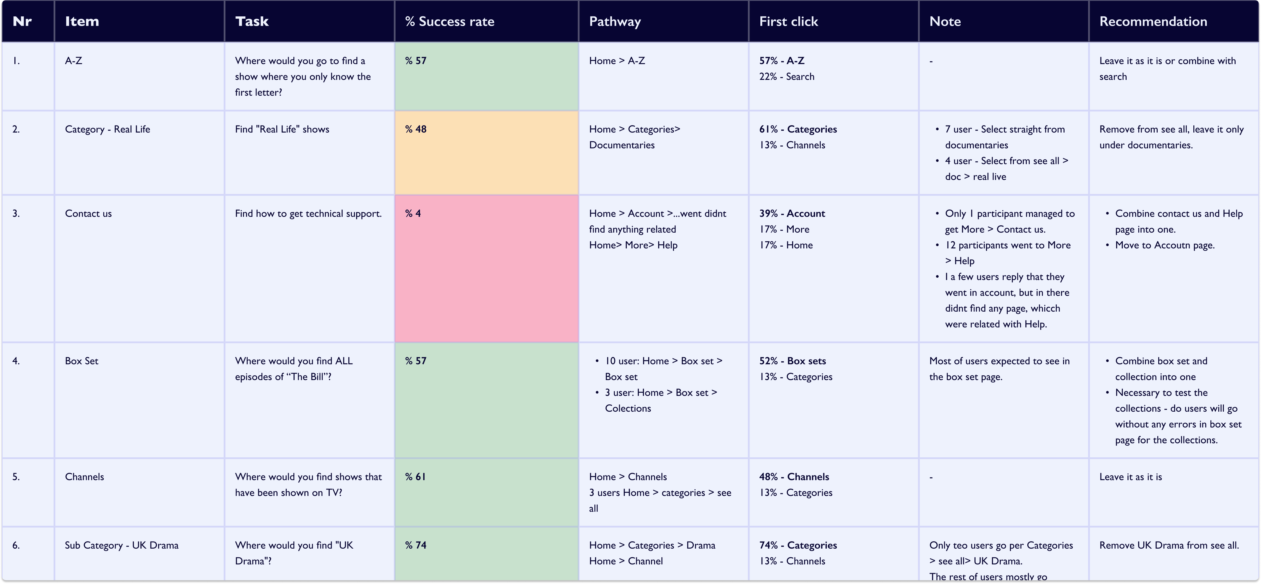
I ran a tree test and card sorting to define what the information architecture should be. We ran the tree test with 30 participants, and asked them to navigate to specific areas on the website. To understand how people tend to group information , we run a card sorting test with 15 participants.
Revising user flows
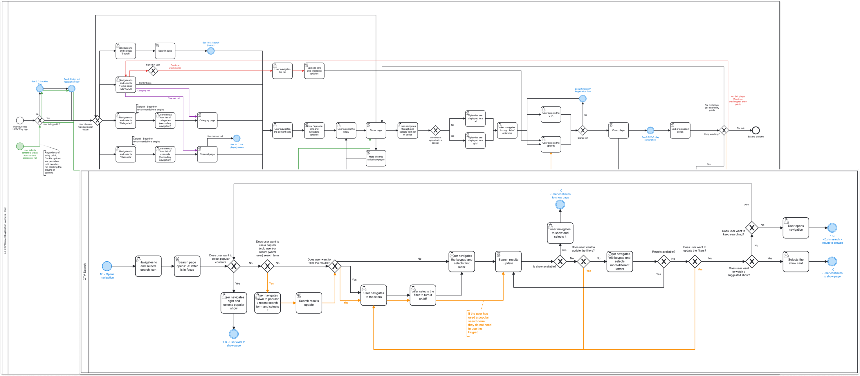
I created users flows which helped us see edge case scenarios and provide solutions to tackle them.
Ideas sketch workshop
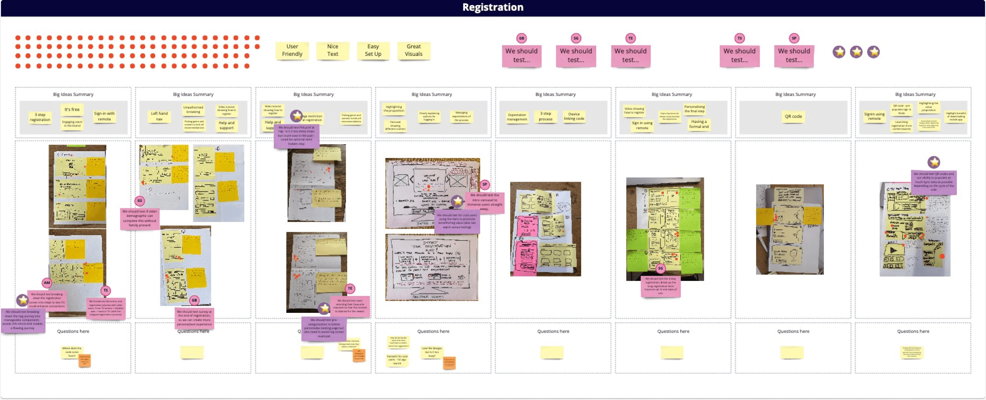
A two-day solution sketching workshop was held to capture initial solutions for the following user journeys: Registration, Channel, Search, Homepage, and Engaging with content.
Wireframes
Based on our research and recommendation, we developed wireframes for CTV, web and mobile app (iOS). Wireframes helped quickly show how the platform should look and defined content hierarchy.
Make it easy to discover new content
Promoting content discovery at various touchpoint throughout the customer journey to improve retention. Improved onward player journey. Highlighting featured and exclusive content.
Seamless registration and device linking
Clear instructions, smaller steps to reduce cognitive overload. Promoting the value proposition, promoting personalisation.
Bringing a modern and familiar look and feel
The CTV app highlights the TV brand while promoting a sense of familiarity with users experienced with other VOD platforms.
Simplified the navigation and user journeys
Enhanced and simplified the navigation and user journeys throughout the app including content discovery via search, categories, A-Z and channels.
Clear proposition about free service
Promotes the VOD service value proposition and free service offering. Enables users to engage with the content library prior to registration.
More personalised content
The designs and product features promote personalisation of content and leverage existing recommendations engines and algorithms to ensure a unique and personalised experience and appeal to the product’s broad user groups.
MATERIALISE
Iterative testing
I tested the main journey with 10 users. We decided to run two usability test iterations.
Key findings
During the 1st iteration, we identified challenges with users navigating the CTV app and identifying nav and focus states. This was addressed by altering the size of the CTA button and having aqua focus states throughout the app, including in the navigation bar.
Iteration 1 noted challenges with registration. Users felt that the registration process was too long due to the addition of a separate success screen following the content preferences survey. These challenges were addressed by combining the survey and the success page.
Iteration 2 proved that the change in the nav state improved the overall usability of the application and improved the user experience. Iteration 2 also proved that the registration flow had been optimised to support a more seamless first interaction and user experience when registering for the product.
Final designs
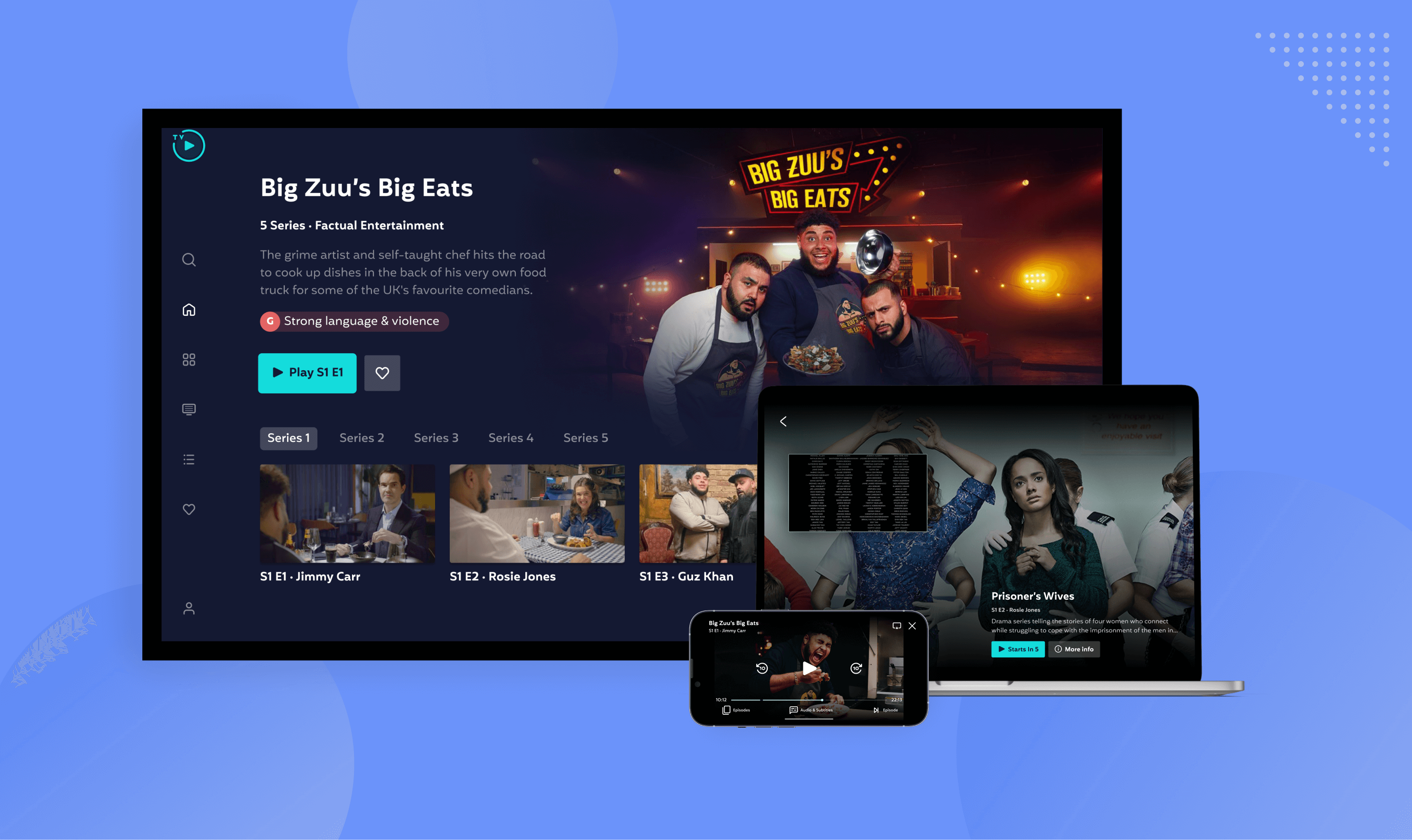
Based on usability test results and previous research, we created hi-fi design concepts for CTV, web (Desktop, tablet, mobile) and iOS mobile app. We annotated each design concept and component, to describe its functioning, and the rationale behind it.
Registration
We have improved the registration flow, breaking the flow into smaller steps to improve the user experience and not overcrowd the screen with information. We also promoted the value proposition, encouraging new users to register.
When a user first clicks a sign in CTA, they are first prompted to enter their email address, from there - the user will be taken to the sign in or registration flow depending on whether they are already registered.
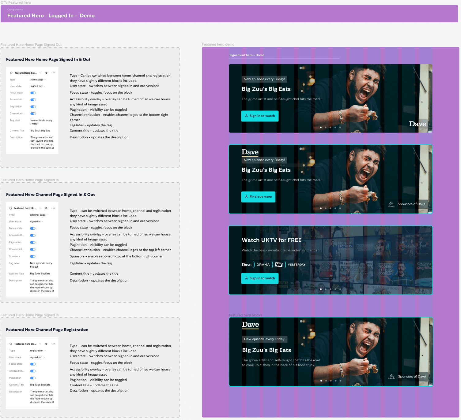
Utilizing Figma to its fullest to help the dev team and ensure consistency
We created a design system for the web and CTV, which allows consistency and is useful to everyone involved. It consists of the global design system (colour, icon, typography, grids) and components.
Conclusion
Developed a Hi-fi prototype for CTV, web and mobile app, targeted at helping people discover content more easily and create a more pleasing product experience. All designs were carefully built based on the research results, this ensured that all the identified issues were properly addressed.


